The Palace of Typographic Masonry '23

We see many types of visual communication every day. We ourselves increasingly use pictures, gifs and emoji to make things clear. Are you 'visually savvy' enough to comprehend and withstand this stream of images? You will find out from 22 April to 18 June 2023 at the Grote Kerk Breda.
This was the Dutch premiere of The Palace of Typographic Masonry, organised by Graphic Matters in collaboration with Richard Niessen and the Grote Kerk Breda.
Everywhere you look... posters, illustrations, animations, text, infographics, clothes, books, illuminated signs, videos.

Foto: Parlor Fotografie
Visual language under scrutiny
Since 2015, designer Richard Niessen has been working on The Palace of Typographic Masonry, originally an imaginary museum in which he collects graphic objects. Not just because they are beautiful, but because they are characteristic of the way in which graphic designers create visual communication. To make the collection accessible to all, he collaborated with Graphic Matters to develop an exhibition and an audio tour through which he provides a personal explanation.
Nine departments
Designers have a variety of tools that they can use and combine in countless ways to create books, websites, maps or any design. Richard Niessen calls this process of building with signs, symbols and ornaments 'Typographic Masonry' and has already collected, described and categorised more than 800 resources from different designers: the departments of The Palace.
The Grote Kerk Breda is a typical example of a three-dimensional visual story, filled with signs and symbols. Especially for this occasion and location, the exhibition has been extended with an interactive element; a place where designs are analysed and visitors explore the relationship between the exhibition, the Grote Kerk Breda and their own environment. In addition, a newspaper was developed, linking the themes of The Palace with examples in the church.

Foto: Parlor Fotografie
26 drawers
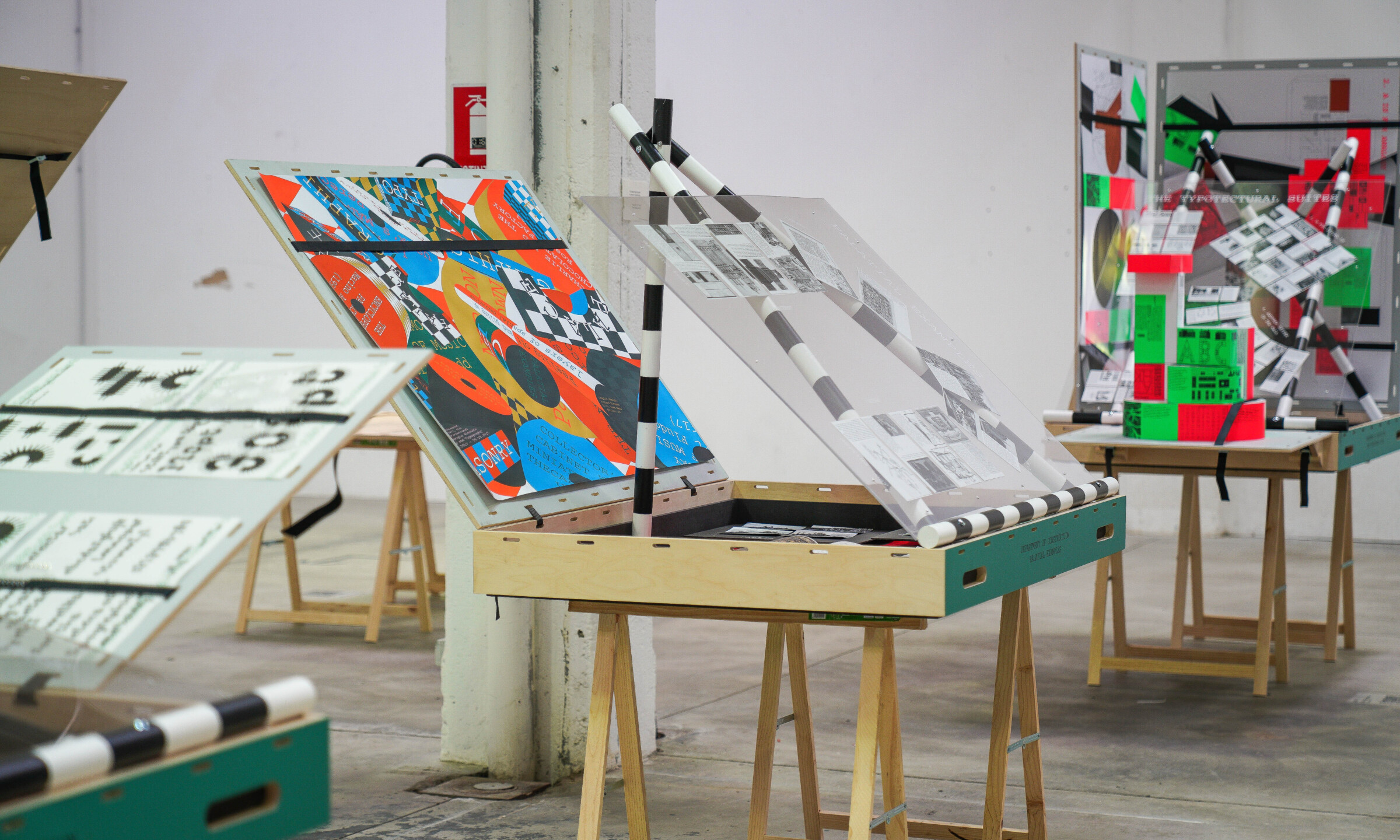
The exhibition was made up of 26 drawers divided into the nine departments. In those drawers, everyday but also unique graphic objects were on display. From posters to packaging and from books to stamps. All these different objects reflect the diversity of visual culture.

Foto: Parlor Fotografie
More than 170 index cards
Each object in the exhibition has its own index card with an image and description. The cards are arranged in a pattern, which is different for each of the total of 26 drawers.
The starting points for those patterns are the contents of the collection and how the patterns relate to each other, similar to an alphabet or map. These cards and the patterns are also designed by Richard Niessen.
Renowned Dutch designers and international talents
The exhibition included work by renowned Dutch designers such as Karel Martens, Hansje van Halem, Wim Crouwel, Harmen Liemburg, Experimental Jetset, Thonik, Moniker and Irma Boom. In addition, the designers Ott Metusala (EE), Farah Fayyed (LB), William Jacobson (SE), Edgar Walthert (CH), Benjamin McMillan (UK) and Åbäke (UK) were invited to create new work.
About Richard Niessen
Richard Niessen (1972) is known for his colourful posters and expressive typography, innovative identities and collaborations with other artists. Niessen teaches at the KABK in The Hague, gives workshops and lectures all over the world and exhibits at prominent museums and festivals.
The Palace of Typographic Masonry was organised by Graphic Matters in collaboration with Richard Niessen and the Grote Kerk Breda and was made possible by the Municipality of Breda, Kunstloc, Pictoright and The Stimuleringsfonds Creatieve Industrie.
